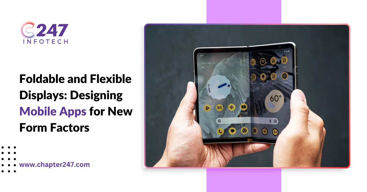
With foldable and bendy shows gaining traction inside the cellular industry, the need for optimised foldable smartphone app design has become critical. These devices result in new possibilities for a person to enjoy.
However, it demands innovation in phrases of layout and functionality. As displays increase or shift, so does the complexity of creating apps that characteristic seamlessly throughout particular states and orientations. Designers want to reimagine traditional app layouts, ensuring apps are as bendy as the gadgets.
How Do Foldable Devices Affect the Morden App Development?
With their innovative design, Foldable devices present a flexible user experience beyond the classic smartphone or tablet. This constitutes a challenge for app developers in terms of research and testing for optimisation.
Additionally, the multiple window support must be seamless, and functionality has to be improved depending on the different configurations of various screens. Examples are video streaming apps, business, and social media applications.
- Video viewing apps: How the screens are arranged while switching from portrait to landscape mode and vice versa must be considered to maintain consistent usability. This means developers are to develop fluid layouts that adapt to changing sizes of screens.
- Business Apps: Business professionals will now multitask much better because they can have many apps open side by side using foldable screens. Developers should be able to integrate foldable user experience attributes into their business software designs, both single and multi-screen usage.
- Social media apps: Some more scope for interactive elements like chats displayed while browsing the feed may be seen. Foldable smartphone app design would be displayed without issues when the “flex mode” of folded devices is turned on without losing functionality as per the app development process.
The global market for foldable smartphones is estimated to be about USD 26 billion in 2023 and will grow with a compound annual growth rate of 21.9% between 2023 and 2033, according to the latest report from Market.us.
Factors To Consider for Developing a Foldable Device App
Designing for foldable devices requires a consistent visual hierarchy, smooth transitions, and flexible layouts. Interactive elements in foldable smartphone app design must remain intuitive and easily accessible, even in split-screen mode. This approach ensures an adaptable UI/UX that enhances user engagement while maintaining clarity and functionality across varying screen sizes and orientations.
- Consistent Visual Hierarchy: As proven, when the device is spread out, there is more display screen real estate—the designers redesigned the factors to enhance the extra area. However, maintaining the evident, visible, flexible display UI/UX is essential as changes confuse customers when completing the layout.
- Smooth Transitions: Switching between folded and opened states must be supplemented with intuitive animation. These transitions make the trade among form elements look herbal, and help customers remain engaged in locating the glide of records.
- Flexible Layout Design: Applications must be observable and always on the top layer to be available to the consumer. This suggests a foldable smartphone app design that is up-display screens by orienting themselves strictly according to the page to be dispensed. The need for the app to adjust in size and reposition aspects gives the consumer a split-display screen view to allow the consumer to interact freely with both applications.
- Interactive Elements: All the buttons, including the navigation bars and other components, should be convenient and easily accessible in the cut-up-screen mode. One should not overload the flexible display UI/UX, primarily when the screen is split into zones during operation.
Challenges That You Should Know About
Designing apps for foldable form factors adds specific concerns for user engagement and use to the design space. Here are four key challenges to acknowledge:
- High-End Quality: The screen layout must be considered to maintain consistent usability when switching from portrait to landscape mode and vice versa. High-quality apps increase the satisfaction and effectiveness of users. When used to their optimum level of utility, the best applications enhance the users’ satisfaction levels.
- Rigorous Testing: The flexibility of folding angles, transitions between them and multitasking should be tested as much as possible to have the most responsive UI and similar performance.
- Increased Time and Cost: Adapting the foldable smartphone app design to fit different screen types and resolutions increases development time and costs regarding quality assurance.
- Changes and Updates: Subsequent updates and feedback monitoring for the selected innovation are inevitable to ensure compatibility when interacting with new technologies and users.
Conclusion
Foldable smartphone app design and bendy displays are a complex but profitable venture. These devices offer new opportunities for more suitable consumer stories; however, they require designers to rethink traditional app layouts. By focusing on fluidity, flexibility, and responsiveness, designers can create apps that paint seamlessly across diverse display sizes and orientations.
However, no matter what, you should not ignore the challenges that come with this innovation. These challenges include quality, testing, time and cost, and changes and updates. Analysing these challenges, impact, and consideration, you can develop a mobile app you will be proud of. If you face any problem during the development, don’t hesitate and come to Chapter247.


